
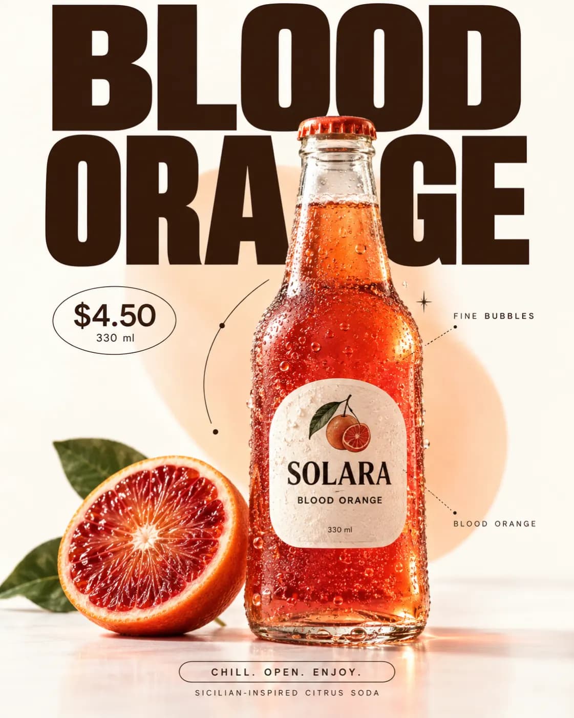
Most "bad AI product photos" are not a model problem. They are an instruction problem: the prompt described the object and left everything that makes a photograph look real to chance.
Write the light first
A camera does not see objects, it sees light bouncing off them. Start there:
Soft north-facing window light from the left, one white bounce card on the right, deep shadow falling away to the back right.
That single sentence fixes direction, quality, and contrast ratio. Every model in the lineup responds more reliably to it than to "professional lighting".
Then the surface
Shadows and reflections are where a fake shot gives itself away. Name the surface the product sits on and what it does to light:
Matte oatmeal linen, slight weave visible, no reflection.
Then the lens
Focal length carries more meaning than most people expect. A 100mm macro says "catalogue"; a 35mm at close range says "lifestyle" and introduces the mild distortion viewers read as a real photograph.
What to leave out
Resist listing adjectives. "Beautiful, stunning, high quality, 8k, award winning" does nothing the resolution setting does not already do, and the tokens are better spent on something specific.
A worked example
Amber glass dropper bottle, centred, on matte oatmeal linen. Soft window light from camera left, white bounce right, shadow falling back right. 100mm macro, f/5.6, focus on the label. Nothing else in frame.
Run it across the models side by side and keep the one whose glass reads best — they disagree most on transparent materials, which is exactly why comparing beats re-prompting.