
A tiny lantern can make a pixel scene work: a few warm squares against a dark doorway, readable even at thumbnail size. Ask a pixel art generator for a detailed fantasy village, though, and that lantern may disappear into soft lighting and hundreds of competing details.
Start with the constraints that matter: what the image is for, how small it needs to read, and which colors carry the subject. This guide takes you from that brief to a generated concept, then through the cleanup needed if your destination is a game sprite.
What a pixel art generator actually controls
There are two useful outcomes here: an illustration with a pixel aesthetic, and an asset whose individual pixels obey a precise grid. A landscape for a blog header can succeed as an illustration. A character placed beside existing game sprites needs consistent dimensions, outlines, colors, and scale.
LoveImage's Pixel Art tool uses a text-to-image composer. It adds a style instruction requesting crisp pixel edges, a limited palette, no antialiasing, and a consistent pixel scale. You choose a model and aspect ratio, with quality options where the model supports them; there are no dedicated grid-size or palette controls.
That makes it a starting point for exploring scenes and character concepts. A request for “32 × 32 pixels, eight colors” is guidance to the model, not a guaranteed export specification. The general text-to-image tool also accepts pixel-style prompts, but you should include the full style direction yourself there.
Pick the working grid before adding detail
The working grid is the canvas on which you intend to edit the final pixels. It is separate from the generated file's resolution and from how large the image appears on screen. A large download depicting chunky squares is not automatically a correctly constructed small sprite.
For a first project, choose a target that leaves enough room for the subject's defining feature. These are suggested starting points for your pixel editor, not output settings in LoveImage:
| Intended asset | Suggested working canvas | Detail to prioritize |
|---|---|---|
| Inventory item | 16 × 16 | A recognizable silhouette and one accent |
| Small character | 32 × 32 | Pose, head shape, and separation between limbs |
| Building icon | 64 × 64 | Roof shape, entrance, and a few windows |
| Small environment | 160 × 90 | Large foreground shapes and a clear focal point |
A sixteen-pixel-wide potion bottle has little room for engraving, glass reflections, and a hanging label. Keep the bottle shape and colored liquid; let the rest go. If those extra details are essential, choose a larger working canvas before you start drawing.
In the generation prompt, describe the intended simplicity as well as the grid target. “Compact inventory icon, broad color clusters, one highlight” tells the model what to leave room for. Save the exact dimensions for the later editing step.
Give each palette color a job
Begin with a small color budget, such as eight colors for an isolated object. Assign roles before picking shades: background, outline, shadow, main surface, lighter surface, highlight, and one or two accents. A palette with clear light-to-dark separation is easier to read than eight similarly bright colors.
For a mountain station, you might use deep navy for the darkest edges, muted blue for distant slopes, pine green for trees, terracotta for the roof, and amber for lit windows. Reserve the brightest color for the focal point. If every window, flower, and cloud gets a bright accent, the eye has nowhere to settle.
Write those relationships into the prompt: “muted blue surroundings, dark green building, amber doorway as the only bright accent.” You can request eight colors, but inspect the result rather than assuming the limit was followed. Smooth shading can introduce many near-identical shades.
To enforce a palette during cleanup, use an editor with indexed color support. In indexed mode, each pixel refers to a palette entry, as explained in Aseprite's color-mode documentation. Reducing the palette still needs a visual check: two distinct surfaces may collapse into the same color and lose their separation.
Write prompts around one readable subject
A useful prompt names the subject, viewpoint, composition, color relationships, and edge treatment. Put the subject first so you can see whether the brief is asking for one image or several competing ideas. Describe the intended pixel scale instead of relying on “retro” alone.
These prompts are starting briefs, not claims about tested results. Each leaves out details that would compete with its main subject.
An inventory item
One squat glass potion bottle with a cork and red liquid, front view, centered with empty space around it. Pixel art concept for a small inventory icon, simple silhouette readable on a 16 × 16 working grid. Limited palette of charcoal, cream, muted red, dark red, and pale pink, one small highlight. Uniform square pixels, hard edges, flat background, no lettering or decorative border.
The bottle needs to remain recognizable without its highlight. If the silhouette is weak, change the proportions before asking for more shine or texture.
A character concept
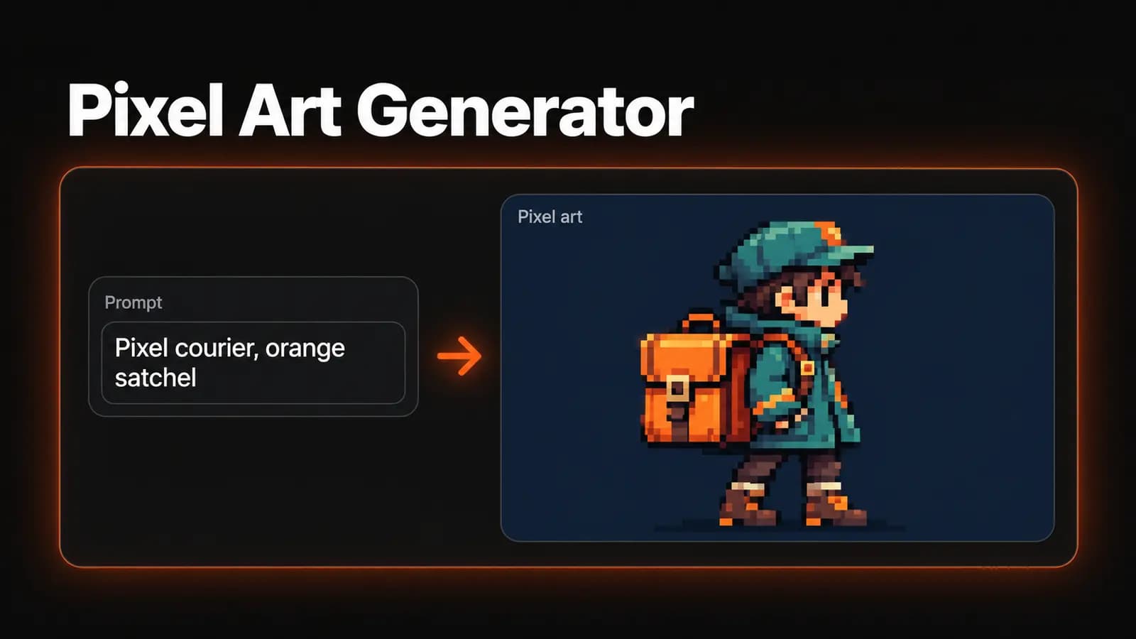
A small courier carrying a square satchel, full body, facing right in a side view, standing still. Pixel art character concept with the simplicity of a 32 × 32 sprite. Clear gap between the legs, short coat, oversized satchel as the defining feature. Dark navy outline, teal coat, warm cream face, orange bag. Consistent pixel scale, flat shading, plain light background, no scenery or text.
The satchel gives this character a recognizable shape. Asking for one standing pose also makes inspection easier than beginning with a sheet of many poses.
A wide environment
A tiny mountain railway station at dusk, wide side view, station entrance as the focal point, one empty platform and layered mountains behind it. Pixel art environment with broad, deliberate color clusters. Muted blue mountains, pine green station walls, terracotta roof, amber light in the doorway. Hard pixel edges, uniform pixel scale, restrained shading, no gradients, no readable signs, no crowds.
For another version, change one concrete feature, such as the time of day. Keep the viewpoint and building description stable so you can compare the change without rewriting the whole scene.
Decide what makes a draft worth keeping
On LoveImage's Pixel Art page, enter your brief and choose an available model. Select an aspect ratio that suits the composition: a square for an isolated item, or a wide frame for the station. Review the displayed credit cost, then click Continue to editor and sign in to reach the workspace. Generating through this tool requires an account with a verified email; review your settings there before clicking Generate image.
Quality controls depend on the model. For example, Z-Image offers a single Standard quality step, so you will not see a choice of quality levels for it. Keep the model and framing unchanged while revising your first prompt so you can focus on what the new wording changes.
Before generating, finish this sentence: “I will keep this draft if…” For the courier, that might be “the bag reads clearly and both legs remain separate at small size.” A beautiful background cannot compensate for a character that fails that check.
If the work is intended for a commercial project, review the plan permissions and limits before choosing a plan. LoveImage's free plan does not include commercial use; Creator, Studio, and Scale do. That decision is separate from whether the image is technically ready to use.
Turn the concept into a consistent pixel asset
Keep the original download, then work on a copy in a pixel editor. For an exact sprite, create the target canvas and use the generated image as a visual reference. Resizing can help establish a rough base, but it will not reliably decide which details deserve the few available pixels.
Clean the silhouette first, then the large shadow and highlight regions. Replace stray dots with intentional clusters, give repeated outlines consistent thickness, and check that diagonal edges have a deliberate stepping pattern. View the sprite at its intended display size between edits; problems that look tiny when enlarged can dominate a small face.
Next, apply the chosen palette and inspect any regions that have merged. Check transparency separately if the asset needs it: a painted checkerboard or plain background is not evidence of a transparent file. For repeating tiles, place copies beside one another and inspect the seams on all four sides.
Once the base pixels are correct, enlarge presentation copies by a whole-number factor using nearest-neighbor scaling. A 32 × 32 sprite enlarged four times becomes 128 × 128, with each source pixel occupying a 4 × 4 block. MDN's guide to crisp pixel art explains this mapping and why smoothing blurs the boundaries.
Fix the largest mismatch, then stop
If the result feels like a smooth painting, simplify the lighting instructions and ask for flat shading with larger color clusters. If it feels noisy, remove background objects and decorative details. If the subject disappears at small size, strengthen its silhouette and its contrast against the background before changing the palette again.
Repeatedly asking for an exact color count will not replace palette cleanup. Likewise, a request for a sprite sheet does not validate frame alignment or character consistency. Move into a pixel editor once the concept is worth keeping and the remaining problems concern individual pixels.
Choose one object or one small scene for your first attempt. Open the pixel art generator, use the closest prompt above, and judge the result against your grid, palette, and small-size readability goals.